EN
EN FR
FR PT
PT AR
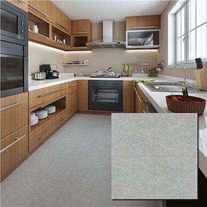
ARWhile you're spending more time at home, changing the color of your kitchen cabinets can be a great way to mix things up and freshen up a space that feels all too familiar these days. To help you choose the right shade, Hanse brings you the main points to consider when choosing the best kitchen cabinet color for your home.

By choosing personality colors for kitchen cabinets, cooking and entertaining are sure to be even more enjoyable. A coat of white paint can brighten up any space, although some people prefer the natural look of wood and others inject personality into their kitchen with deep blue and red paint colors on the cabinets. But the following nine points are important when choosing a color for the kitchen.
Consider the balance of the color arrangement
Harmonize with the surrounding colors
Consider the balance of the entire space
We are particular about materials and patterns
Order a sample
Pay attention to lighting and sunlight
Try to refer to Fengshui
Perform color simulation
Determine the color according to the atmosphere
There are many types of colors, such as bright colors and calm colors, so many people will have trouble choosing a color for the kitchen. Therefore, we will explain in detail the points when choosing the color of the kitchen below, so please refer to it.
1. Think about the balance of color schemes
When deciding on a color scheme for your kitchen, it is a good idea to consider the following three colors.
Base color
Main color
Accent color
The base color is the color that accounts for about 70% of the total. The main color is the color that is said to be good to insert in about 20 ~ 30% of the total. Finally, the accent color is the color of the space, so let's think about 5% as a guide.
However, it is okay not to forcibly apply to the above three colors. The most important thing is to color coordinate the space where you can spend a comfortable and enjoyable time. Therefore, let's keep it as a reference when considering color schemes.
2. Make the color blend in with the surrounding color
First of all, it is important to think about harmony with existing floors, walls, curtains, furniture, etc. If the color of the kitchen and the shade of the interior becomes a chig-hug, you may regret choosing the color. In particular, it is important whether it harmonizes with floors and walls that cannot be easily replaced. It is recommended to match with the same color as much as possible.
For example, if the floor is dark-colored, a bright color will be used, and if the floor is light, a deep color kitchen will be used, and the space will be sharp.
3. Consider the percentage of the total space that the kitchen occupies
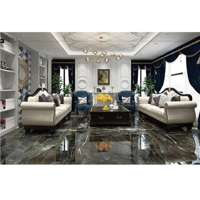
Let's also think together about whether the kitchen location is large or small. For example, if the kitchen or living room is small, choosing a dark color will create a sense of pressure. Even though you have renovated it for a long time, it will become a restless space. On the other hand, if you have a kitchen in a spacious house, you may want to try using bright vivid colors as accents. Or you can try to put it together in a color that will be consistent with other rooms and interiors. If you are worried about the design, ask a remodeling company to create a three-dimensional diagram and grasp the image of the entire space.
4. Pay attention not only to color but also to materials and patterns
The atmosphere of the kitchen is something that changes depending on the texture of the door, in particular. The wood grain tone differs depending on the pattern of each material. Even if it is the same color, depending on the material, it will pop or become elegant, and it will be a completely different image. When choosing the color of the kitchen door, solidify the image you want to create, and then choose the material. There are also various materials for the worktop.
Depending on the difference in materials such as artificial marble and stainless steel, the feeling of heaviness and atmosphere also change. Think about the balance between the worktop and the overall and choose a combination that looks great.
5. Ask for samples if you can
If possible, it is a good idea to ask the remodeling company to order a sample of the material of the model you are interested in. Although it is not limited to the kitchen, the color taste seen in the catalog or on the Internet may differ from the color of the real thing. Be careful, however, that samples are often small in size, so light and dark feel different from the actual kitchen. The larger the area, the lighter colors tend to feel more vivid and the darker colors tend to look darker and duller.
6. Pay attention to lighting and sunlight
When determining the color of the kitchen, consider the lighting and sunlight. Basically, the way you look at the home and in a showroom is different. When deciding on the equipment of a house, it is important to check the actual thing in the showroom to know the height and usability. But care must be taken when it comes to color. The equipment on display in the showroom is illuminated and coordinated so that the color best appears. Therefore, if you put it under fluorescent lights or LED lighting in your home, the atmosphere may be different from what you expected. Let's check carefully whether the color of the kitchen you want to adopt with the lighting at home looks beautiful. Also, it is safe to check the sunlight around the kitchen.
If the sunshine conditions are not very good, the dark kitchen will look dark. Conversely, if natural light or lighting is too bright, it may be too dazzling in a kitchen with shiny materials or pure white colors. If you can order a sample, it is a good idea to check the above points as well.
7. Even if you refer to Feng Shui in the kitchen
The kitchen is a spot that controls fortune in Feng Shui, so it is a good idea to refer to it when choosing colors. In a kitchen where the opposite types of qi coexist, "fire" and "water", the balance of feng shui is very delicate. Since the lucky color is different for each direction when remodeling the kitchen, why not incorporate Feng Shui as one of the references.
8. Do a color simulation
If you are worried about choosing a color, it is a good idea to do a color simulation so that you can easily grasp the image of the kitchen after construction. Depending on the contractor, the color simulation will be done carefully, so let's check when choosing a contractor. However, even if you do a color simulation, there is a possibility that there will be a slight deviation from the image depending on the lighting in your home. With that in mind, let's choose the color of the kitchen.
9. Recommended color systems by the atmosphere
It's also a good idea to focus on what kind of atmosphere you want your kitchen space to look like and decide on the main color. If you want a simple and boring design, white is the best choice. The appearance is neat, and above all, there is no failure of color coordination with the surroundings. Sunburn and dirt are easily noticeable, so let's pay attention to frequent care and sunlight. In addition, for those who want to create a natural and calm image, the wood-grain kitchen is also popular. Dirt is less noticeable, and a relaxing effect can also be expected.
If you want a little tint, choose pastel colors such as pink, yellow, and orange. Light colors give a cute impression and are relatively easy to combine with the surrounding colors. If you like cold colors, we recommend light blue or yellow-green.
If the walls and floor are bright colors, there is also a way to give a profound feeling in a dark kitchen such as black or deep blue. On the other hand, if the walls and flooring are dark colors, avoid making the kitchen itself a heavy color, as it will create a heavy space.
If you are confident in your coordination and want to create a unique kitchen, why not try "two-tone color (2 colors)". Dark color only on the top will give a good accent. Even if the lower part is a clear color, if the upper part is similar in color to the ceiling, the whole look wide.
Furthermore, even with the same color, the atmosphere changes considerably depending on whether it is a "mirror finish" or a "matte finish". "Mirror finish" is suitable for giving a sense of luxury. However, it has the disadvantage that it is expensive and stains such as oil and fingerprints are easily noticeable. "Matte finish" is easy to get dirty, but it is not glossy, so it is ideal for those who want a matte impression.


 16
16