EN
EN FR
FR PT
PT AR
ARWhat colors are on trend for interior 2022? Every year leading paint companies translate global design trends into the color of the year. In this guide, we are going to see the top 5 home decor colors for 2022. We'll share with you some ideas on combining and using them in your interiors.
2022 Best Color Trends For Interior - Top 5 Popular Color Design Ideas 2022
We'll see a wide variety of options from colors inspired by nature that evokes relaxation and a healing effect to more vibrant hues that energize spaces. Now let's see what those colors are and decide which of these colors you will use in your interiors!
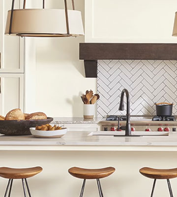
1.Green
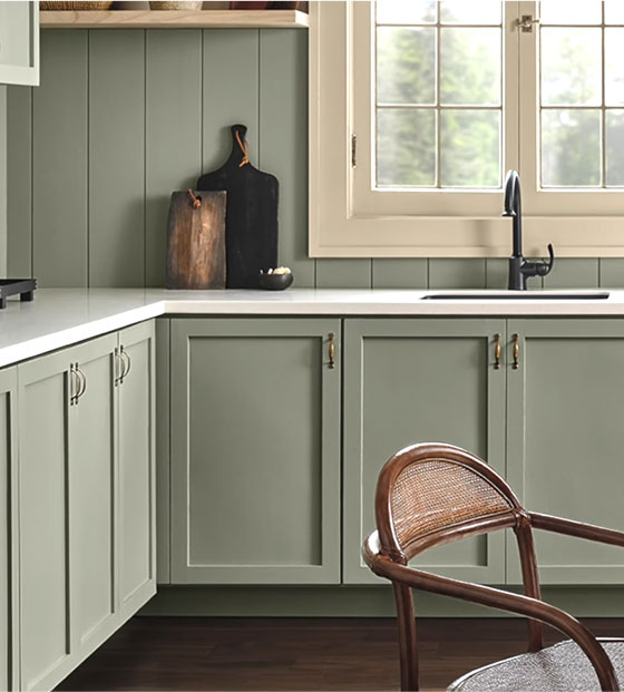
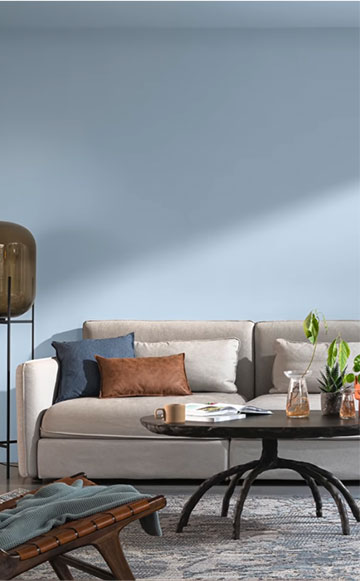
The top color of 2022 is green. Surely you have already noticed multiple leading paint companies have chosen it as their color of the year. Green represents life and renewal, it can refresh in tears and evoke tranquility and calm. Knowing this we understand why it has been the top favorite for 2022. More than ever, we need goals and tears that connect us with nature and meditation. Benjamin Moore has chosen the color October mist, it's a versatile sage green that you can use in any area of your home, from kitchen cabinets, bathrooms, master bedrooms or kids rooms. The subtle influence of this color makes it easy to use in large quantity in our interiors. Thanks to its versatility, you can play with endless combinations. This tone is a good option for people who like grey but want to there to use other options at home without a dramatic effect.
How to combine it?
- To combine this color you can opt for an analogous color skin, combining it with other shades of green and blue for a fresh and relaxed look.
- You can combine it with other shades with green to achieve a monochrome, elegant and timeless color palette.
- On the other hand, if you are daring when it comes to using colors, this tone can serve as a background to emphasize objects and details in complementary colors such as pink or lilac. A very fun subtle and fresh combination.
Another green is the evergreen fog by Sherwin-Williams. A very similar shade but a bit darker compared to the October Mist by Benjamin Moore. This color is spectacular to combine with white, taupe, light wood tan leather, matte black or golden details. It's a good pick if we want relaxed spaces without compromising elegance. Also, it's a lovely shade to paint kits and cabinets combined with gold or black hardware.
2.Bright Skies.
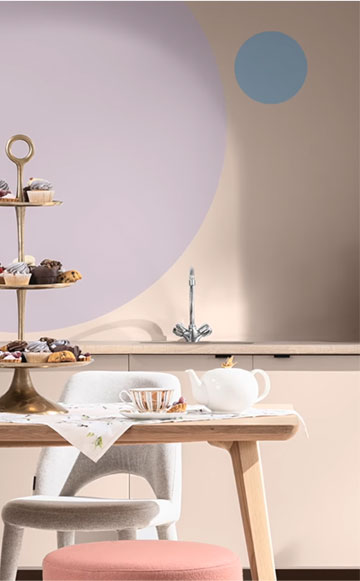
The next color on trend for 2022 is the bright skies. This is a fresh and soft blue which allows versatile and pleasant combination. The lux describes this color as a light airy and optimistic blue, that's good for the soul and it promises to open up and revitalize your home. It's not a secret that blue transmits peace and tranquility, which symbolizes the sky, the air and fresh water. According to color psychology blue is associated with renewal and purity, which makes it a favorite pick for bedrooms or other areas where we want to achieve a state of mind of tranquility.
How to combine it?
- Blue, light green goes very well with warm colors such as earthy tones, browns and natural textures such as wood, white with a warm undertone, grayish, beige and matte black. The combination of these colors and textures results in modern and fresh spaces.
- You can create an analogous color skin, pairing it with other blue or green shades. It could be an exciting alternative to achieve dynamic spaces without losing the concept of elegance. This light blue can also be the primary color in a more fun palette such as kids rooms, workspaces or another particular space you want to play with colors.
- You can dare to go for a combination with high contrast and combine light blue with orange or another similar pastel like lilac pink or yellow.
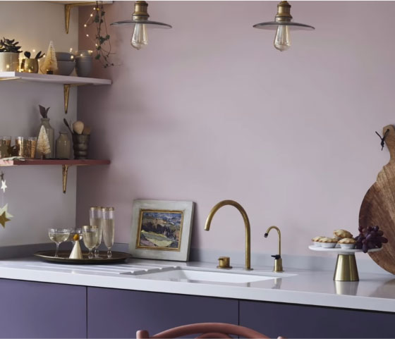
3.Very Peri
It's the very lavender tone declared as interior design color of the year 2022 by Pantone. Pantone describes it as a color that encourages personal inventiveness and creativity. Every year pantone studies society to choose its color, it should be noted that the Pantone not only focuses on interior design, it also impacts fashion, graphic design, art among other artistic disciplines. The meaning of this color is very broad, this color is the result of the mixture of red and blue, so it has the best of both sides. It transmits sensitivity, elegance, luxury and spirituality. Although it seems a difficult color to be used in interior design, it's not impossible, it's a color that could be present in some design styles and trends such as the retro decoration inspired by the 70s where the use of vibrant colors is essential.
How to combine it?
- The easiest way to add this color to an interior is to use it as an accent. Combining it with light neutrals like white. As it's an intense color, distribute different decorative elements in the space such as cushions, faces, an accent chair, flowers or a work of art. It should be noted that you can play with lighter shades of very Peri, within its color family to evoke sensations that lean towards relaxation and tranquility.
- If you are looking for an intense palette, you can dare to combine this tone with its complementary colors such as yellow and mustard.
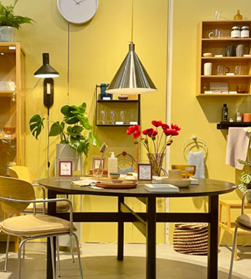
4.Sunny Yellow
In 2022, we’ll relish brighter colours that herald a return to normality. The sunny and uncomplicated Babouche is perfect for embracing this - whilst bold, it never feels garish or overpowering. "Named after the distinctive colour of the leather slippers worn by men in Morocco, this shade of yellow can be described as ‘subdued sunshine. Despite its bold hue, it’s not overly bright or overpowering, making it perfect for a larger room, where its cheerfulness will intensify. "In terms of décor, opt for more minimalist companions, such as simplistic line drawings, or unobtrusive bright shades.
This buttery yellow can help to brighten a space with limited natural light, and when you consider the colour wheel, this particular shade would sit well with a pale blue or a soft pink/red.
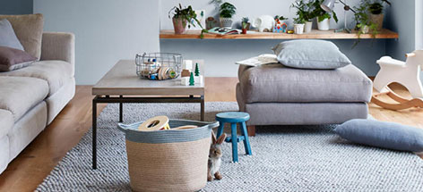
5.Warm Neutrals
Another home décor color trends 2022 in interior design are consistently among the favorites. It's not a secret that these shades are a safe and timeless choice for any interior. Thanks to its versatility, we can change the room's general appearance without a significant investment. The neutral tones that we see among the favorites of fleeting paint companies are all warm neutrals. Sherwin-Williams picked accessible beige, natural linen, pink shadow and shoji white to be part of their master palette. Benjamin Moore opted for its natural linen, collector’s items and the venetian portico. The logs offered artist brush and fossil hunting as their warm neutrals. These warm tones are suitable for combining with the main favorites like blue and green or other neutrals to get a monochromatic and elegant color palette. Apart from the fact that warm neutral tones, make spaces much more pleasant and welcoming, they are the most popular because they are used in contemporary styles like warm minimalism, Japandi and Nordic.
6.Wildflower
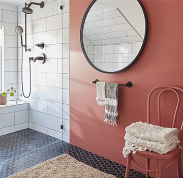
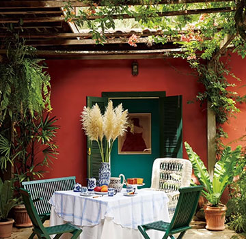
The last popular color design idea 2022 is by adding wildflower in your house. This is an opposite and complementary tone to the color of the year 2022. It's a color between coral, pink and terracotta. So if you like vibrant and energetic colors, this one could be for you.
How to combine it?
- -To combine it, you can use neutral colors such as white to soften and balance the space.
- -You can pair it with warm neutrals for a monochromatic skin. being an intense and vibrant color avoid using it in spaces you need to relax such as bedrooms. Remember that these colors activate the mind. It could be a nice color to add life to social spaces such as the kitchen, living room or outdoor areas such as patios or terraces. In these dynamic areas, you can combine this color with their complementaries such as green or teal.


 16
16