EN
EN FR
FR PT
PT AR
ARColors can transform the way we perceive a space. One of the characteristics of colors is that it allows us to modify the appearance and proportion of a space, we can make a room appear bigger, wider, taller or deeper, all these by using colors. It's important to know where and how to use colors to treat the mind and make our interior look and feel the way we want. In this article, we talk about best interior color tricks and visual effects, we share some pro tips on selecting a paint color for your home decor.
Best Color Tricks For Interior
1.Bright Vs Dark
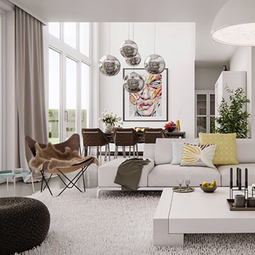
Light colors expand spaces making them brighter and lighter. To whiten or enlarge a space, it is best to use light colors on the ceiling, floor and walls. The lighter the color, the more light will be reflected and larger the room will appear. White is the one that reflects light the most, that's why it's widely used to trick the mind when we want to make a space appear larger. On the other hand, dark colors create a feeling of closeness, surfaces appear closer to the person who is observing.
2.Warm Vs Cool
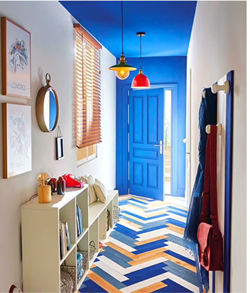
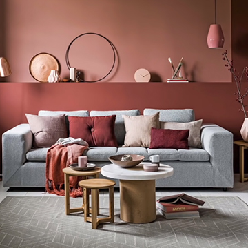
Colors such as red, yellow and orange evoke warmth, they remind us things like sunset or fire. Warm colors are the ones that attract the most attention, they give a sense of warmth and they are strong and can cheer yourself in interior spaces. Warm colors create a comfortable pleasant and welcoming atmosphere. Visually, they create the feeling that the space is smaller. Therefore, they are excellent to use when we want to feel that a large space feels more intimate and cozy.
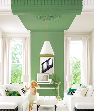
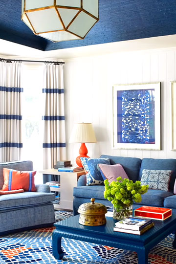
Colors such as blue, green and purple evoke a cool feeling, because they remind us things like water sky or nature in an interior space. Cool colors produce a calm serene relaxed and fresh environment. A small space seems bigger and more spacious because it creates an illusion that the walls are moving away. Cool colors can be ideal for small spaces such as bedrooms, neural corridors or a bathroom, rooms that generally have less space. So warm colors advance and cool colors recede affecting the perception of depth. So when you are going to choose a color, make sure you are clear about the conditions of your space and how you want to fill in it to choose the best color that can help with your design goal.
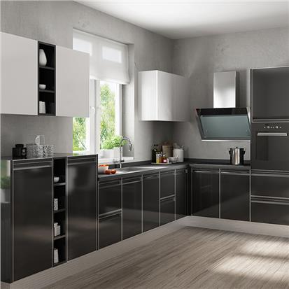
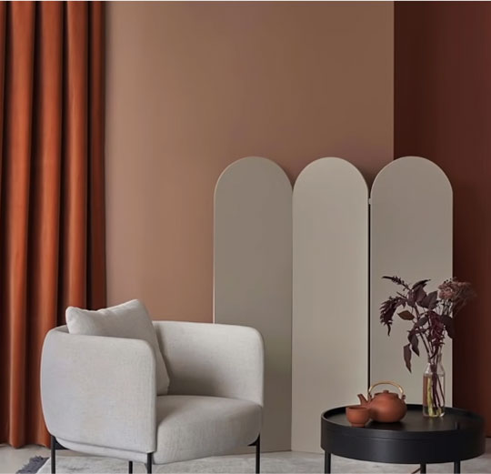
3.Neutrals
If you don't need to enlarge the space, visually, you can opt for neutral colors. Neutral colors cause such dramatic visual sensations because the chromatic content is very low. Still you must take into account the undertone when selecting your neutrals because it can ruin your design. Undertones are the secret code of every near neutral color, it is the subtle influence of one color under the mast on. Neutrals are the favorites to be used as backdrop in interior design because it works for any style and offer versatility as they combine with all colors. If you decide you need a vibrant hue in your life and you have a neutral paint color then you simply add a pop of color throw inexpensive elements like cushions, flowers, vases and so on without affecting the whole perception of your space.
Colors & Visual Effects
Now that you have a precise idea of how warm cool and neutral colors affect the perception of spaces, let's see how to get some visual effects like hide expansion or how to compact a space by using colors. It should be noted that all the effects achieved are only visual since the surfaces or objects themselves are not modified.
- Balance heights: If a room has a very low ceiling, to make it higher at least visually we will have to paint it in a lighter color than the walls. On the other hand, if we want to make it lower, paint it in a darker tone and it will give a feeling of closeness. In some circumstances, lowering the ceiling height can make the space more pleasant and provide a sense of privacy or shelter.
- Increase the width: Painting the back wall and sealing in a darker color. Leaving the side walls lighter will make the space appear more spacious. This is a widely used technique in narrow hallways or rooms.
- Narrow the space: Painting the two opposite side walls in dark colors and leaving the background and ceiling in light colors will make the space more narrow for the eyes, improving the proportion of rooms with unbalanced dimensions.
- Shorten the space: If you have a huge space and want it to feel smaller and more intimate, you should add a dark tone on the back wall and use lighter tones on the other surfaces.
- Shorten the walls: If the idea is to shorten the walls, a dark color should be applied to the bottom of the wall. Expand the spaces, the small rooms are enlarged if they are painted in light colors like neutrals or white since the walls give a receding filling. To accentuate this effect, it is best to match the color of the walls and sealing.
- Compact the space: On the other hand, when you're looking to make the room seem smaller and cozy, opting for stronger colors for the wall surfaces can work well.
Tips For Choosing Interior Paint Colors - How To Pick The Right Paint Color For Your Home
1.Choose the color you like
Considering the visual effects and emotions that a color provokes is very important. It's also important to choose colors that we like and identify with our personality although there are rules and color theories. You must know how you feel under the stimuli of a certain color. Apart from knowing the theory, we must take the individual into account.
2.Thinking about what you already have
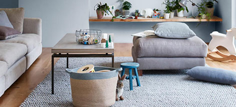
If you don't have any idea about what color to paint, a good way to narrow down your choices is to pull a color out of a piece of art or area rug that's in the room. This color could be a good starting point, you can pick a tint tone or shade within the same hue or color family or select a complementary color.
3.60-30-10 Rule
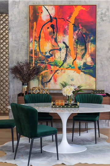
The 60-30-10 rule is used to balance color combinations and to create proportion and harmony between all colors. 60% of the room is the main color, this usually includes large furniture, rugs and walls. 30% of the room is a secondary color, usually includes accentures or an accent wall and their remaining 10% is the accent color, usually includes small pieces such as cushions, artwork, table lamps and accessories.


 16
16


- 8