EN
EN FR
FR PT
PT AR
ARThe imaginative space of ceramic tiles in design is endless, especially in the choice of color. The wide range of ceramic tiles can help designers to achieve different decoration styles. Recently, China Ceramic Tile Association, together with China Ceramic Technology Research Institute and home trend observation, released a report on ceramic tile color trend from 2020 to 2021. There are four major popular tile color trends as follows.
4 Popular Trends Of Ceramic Tile Color In 2020-2021
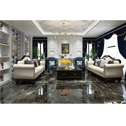
1. Natural Color
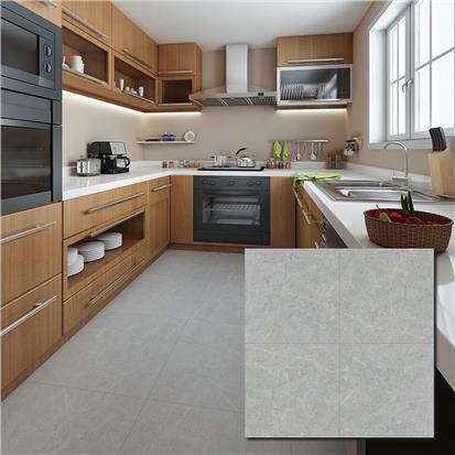
It is an expression of reverence for nature to inject natural elements into walls and floor tiles with colors. From the green that people associate with vegetation, such as moss green and mint green, to natural clay color, can arouse people's feelings of nature. Natural pottery color has a variety of color levels, from bright orange to low-key natural wood, and even dark soil brown. The color of pottery occupies a pivotal position in the organic color system of nature. The reason is that this color reminds people of the most original ecological soil.

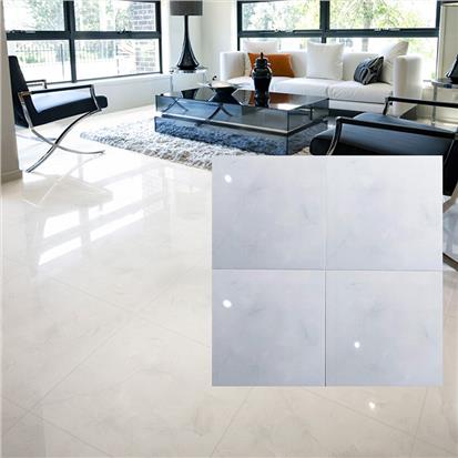
2. Using the light and shade levels of color to create a sense of comfort and happiness
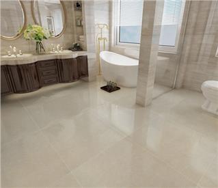
Whether it is wall tiles or floor tiles, if we use simple means of light and shade change in color, we can create a comfortable feeling and bring a strong sense of happiness. At the same time, using this method to deal with colors helps to create the right atmosphere. The focus of this trend is to choose soft colors, such as white and neutral warm colors such as beige and pink. Using light and dark levels to deal with these colors can make people feel warm and comfortable.

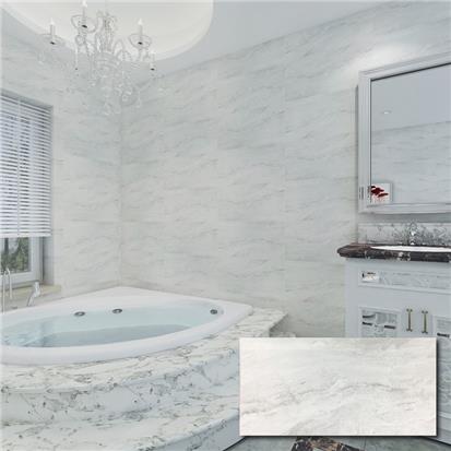
3. The color of natural tie-dye brings the impulse of returning to nature
This kind of color processing method is applicable to a wide range, many colors can use this way to create a memorable environment. Inspired by natural dyes or plant fibers, the colors produced in this way can be soft natural tones, or more bright and lively yellow, blue and red. When these colors are matched with their contrast colors, they are very conspicuous and can catch people's attention at once.

4. Fading color, different luxury
A little treatment of the colors to make them look like they're faded is the key to having a sleek, sophisticated look. Dark blue, matte black, with a bit of gloss, is to create a dark environment with a deep sense of standard. This color contrasts strongly with a mirror-like metallic finish. A variety of different surface effects can be achieved by using oxidation design or color fading treatment.

Do these colors appeal to you? Chinese tile brands Hanse offers collections in a huge variety of different colours and shades, able to bring almost any envisaged colour scheme to life in triumphant style. In comparison with other materials, our ceramic tiles also stand out for their high resistance and inalterability.


 16
16